Has you must know, logos are the chief graphic component of every company’s overall brand identity. Creating a logo and the custom font that comes with it can take months. In this tutorial we will show you how to quickly sketch a logo using the web application Prototypo, a real-time font editor.
Prototypo was launched in 2015 to give designers and type lovers the ability to create unique identities with bespoke fonts.
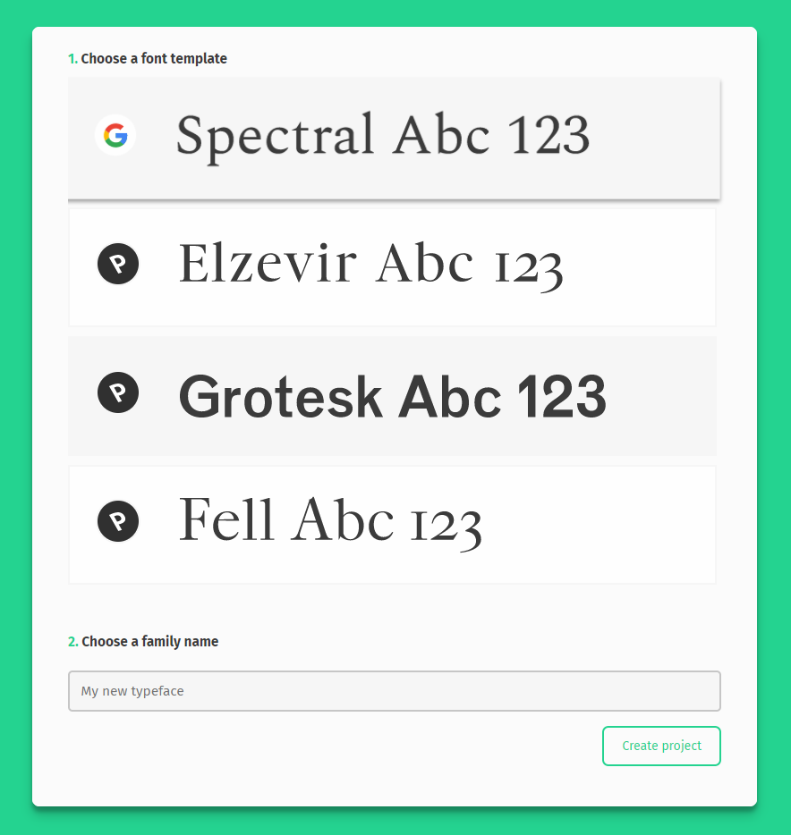
The web application Prototypo gives the ability to create custom fonts and export them to use everywhere (desktop applications, websites…). After choosing one of the four templates available (designed by the international foundry Production Type) users can design their own font by moving over 30 sliders (x-height, curves of the serifs, width…).
The changes apply directly to each character of the Latin alphabet, providing instant
feedback on your work. This different approach to type design brings the opportunity to get stronger visual identity with original fonts.
In this tutorial, we’ll design a logotype for an fictional custom car brand, FIEUR.
Through this example, you’ll see how Prototypo can help to create a first sketch of a logo in a few minutes. Along the way, we will look at how the different features of the software will help you design a font fitting your project.
First step first, connect to Prototypo (a free version gives you a complete overview of the app, subscribe to the full version if you want to export your project) and start a new project.
Choose the Prototypo Grotesk template, name your project and click on Create a family.
Your variant is automatically named Regular but you are free to change it. You can also add as many variants as you want, but we’ll only need one in the following case.
Exclusive for CreativeTacos users : Enter coupon code ” CT10 ” that gives a 10% discount off the annual licence.
First step, choose your font template
Your workspace looks like this: at the top is the word view, on the right the text view and on the left is the glyph view. On the left edge you will find the sliders panel with the different tabs (Setting, Func, Style and Serif). By default, the functional characteristics (Func) tab is opened.
The logo will show the name of the brand, so first, we will write FIEUR in the word view, to have an overview of the result of our changes.
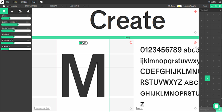
The first step will be to modify the overall design of the font. Start by changing the slant, moving the slider under the Slant feature until you get an inclination that satisfies you.
There are two ways to do this, you can click and drag the sliders left and right or you can enter values in the field just above it.
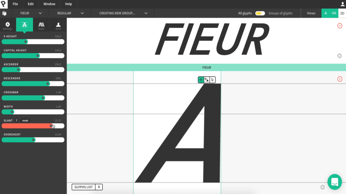
Once you’re happy with the overall slant of your logo, let’s make it bolder, using the
thickness parameter. Like you did with the slant, click on the Style tab in the left panel
and drag the Thickness slider to its maximum. In the same way, reduce the capital height (Capital height slider in the Func tab) and increase the width (Width slider in the Func tab).
These changes give you an example of all the characteristics you can modify in Prototypo,
depending on the style that you want to give to your font/logo.
After that, you’re getting close to what will be the global shape of your logo.
Now we can go deeper into details by modifying the glyphs on an individual basis.
To do this you will use the Parameters Individualisation feature. In the specific case of a logotype, you can create a group for each of the four letters, but it’s also possible to group several letters together.
To create a group, click on the switch on the top bar (All glyphs/Groups of glyphs). You can easily see that you’re in the individualisation mode because the colour scheme turned from green to yellow.
First, type the name of your group in the Group name field. We use to name the group according to the letters it contains, but it is up to you to be more creative!
In the glyph list below the Group name field, choose the letter you want to individualise and click on Save change. You’ll repeat this operation for the letters that make the logo up (in this case: F-I-E-U-R).
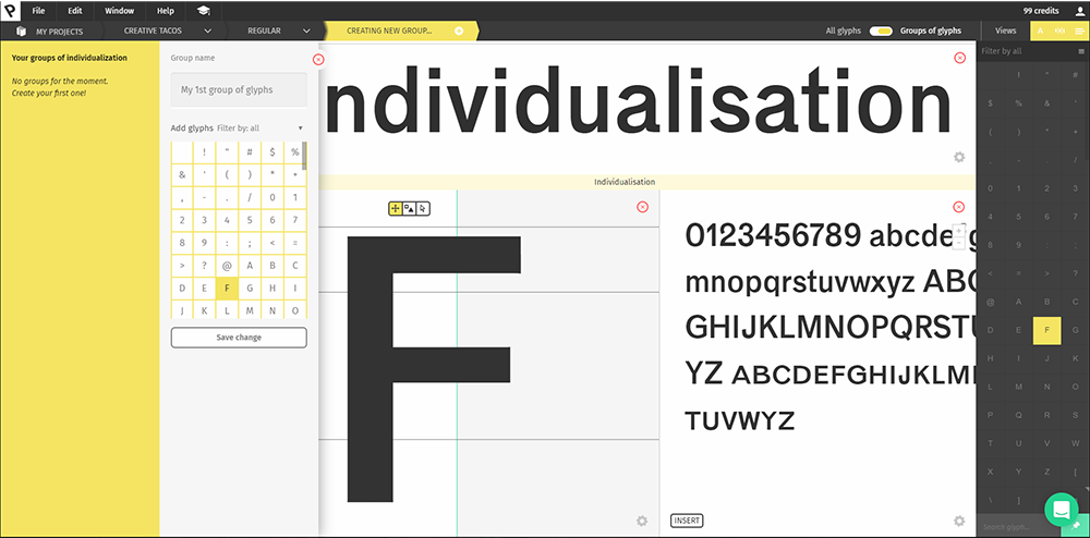
Now that your groups have been created, start by refining the letter F. You just have to
choose it from the breadcrumb menu at the left of the top toolbar. Click on the drop-down menu and open the F group. You’ll see that the workspace has the same sliders as the All glyphs mode, but the ways to modify your individualization parameters are a bit different. The proportional individualization (x) will multiply the current value of the parameters by the individualization value. The second mode is the absolute (+) which will add or subtract the value of the individualization parameter to the “normal” parameters. The changes you’ll make here will only apply to the group, meaning to the letter F.
As we want to reduce the thickness of this letter, click on the Style tab on the left panel, then on the little + and reduce the thickness. The thickness is now modified only on the letter F.
After that, modify the I. You proceed exactly the same way you just did, choosing the I group from the drop-down menu and clicking on Open in Prototypo.
Since you want a serif on the I, click on the Serif tab and increase the serif width. Next, change the serif height. It’s also possible to edit the value we want to change by simply typing it in the number window above the slider.
Now that you’re happy with your serifs, change the thickness of the letter in order to make it more consistent with the way the logo is going to be.
Then modify the E and the U the same way that you did with the previous letters, adjusting the thickness to fit the overall look you imagined before.
To shape the letter R, you will use the Manual Editing, another major feature of Prototypo.
This option will let you transform any glyph without being limited by what the template initially offers. You’ll be able to change the position, distribution of the contour nodes, width and angle of any pairs of nodes, on any glyph.
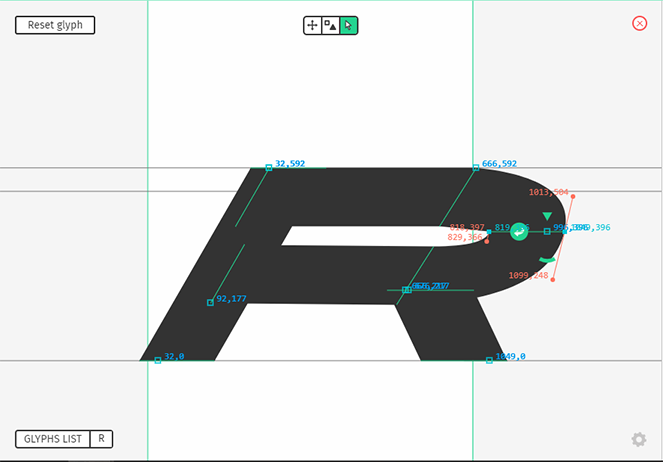
To use it, click on the white arrow button on the glyph view. Click and drag your node to move it. You can zoom in and out by scrolling with your mouse, and move the whole glyph by holding down the Spacebar and dragging.
The nodes are connected with each other so when you move something it can change the overall design. You can reset your last change by clicking on the white arrow on a green circular background just beside your node. You can also use the keyboard shortcut Cmd/Ctrl+Z to cancel your last change. Proceed to a manual change on the U as well, in order to round the bottom of the letter. You can also reduce the width of the letter to fit with the overall design of the logo.
Now let’s modify the spacing of the font. Since we need to apply it on all the glyphs, switch back to the All glyphs mode (at the right of the top bar, just click on All glyphs). The colour scheme turns from yellow to green.
The spacing of a font has a huge impact on its readability, it refers to the amount of space between the characters, and it’s as important as the letter itself. In this example, we chose to reduce it to make the logo more compact. But what works for a logo may appear way too tight for a longer text. You have to handle this parameter with care, and take a close look at the different views (word view/text view) to make sure it’s okay.
Click on the Settings tab (left panel) and move the spacing slider slightly to the left. To
harmonize the spacing between all of the letters you can then return to the individual edition mode and modify it independently. You can also use the word view by clicking on a letter and moving its sidebearings. We did this for the letter I where the serif overflowed onto the other letters.
Now that your design fits your expectations, you are ready to export your font.
At the left corner of your screen, click on File>Export font. Prototypo will export an OTF file in your download folder. If you want to rename your font and the variant before exporting it, click on Export font as. Then, install your font on your computer. Note that you’ll need the full version of Prototypo to export a project, subscriptions start from $1.
Now it’s time to finalise your logo by adding a background, and some elements like the motto. As your font is now installed on your computer, you can open a new
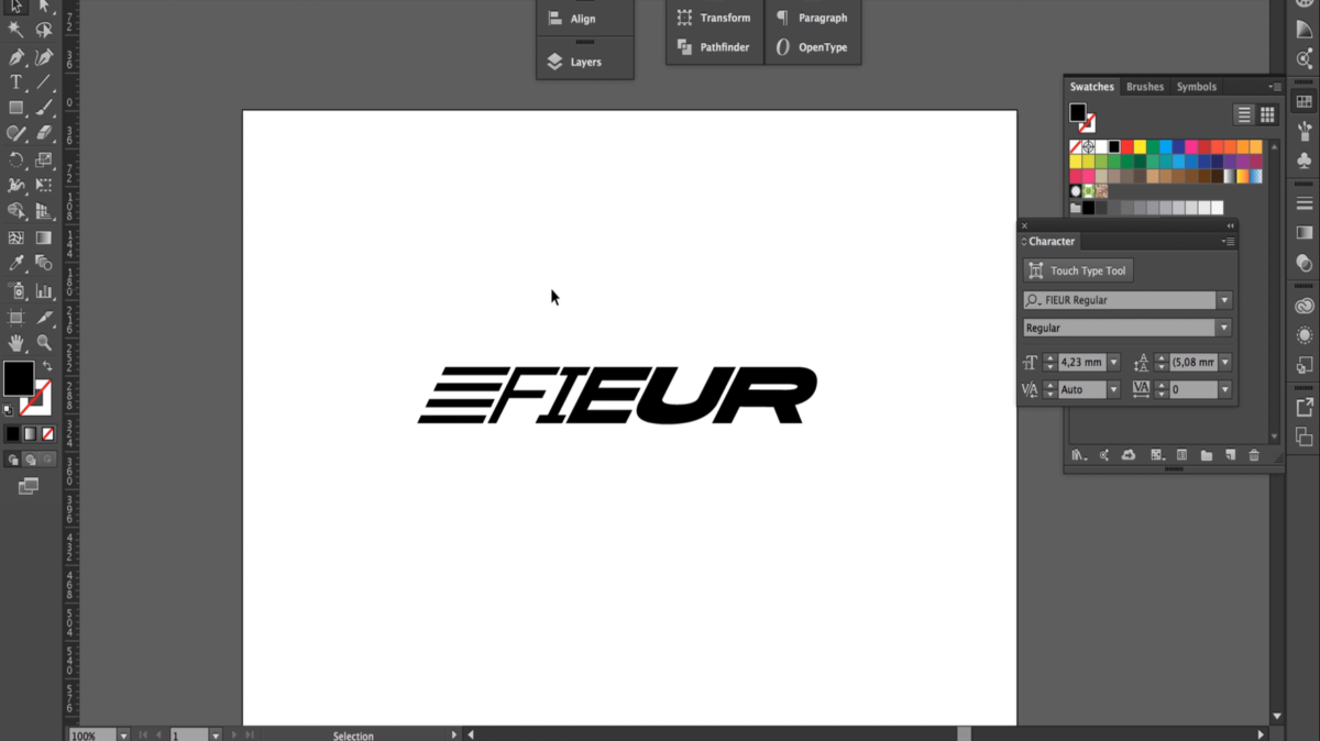
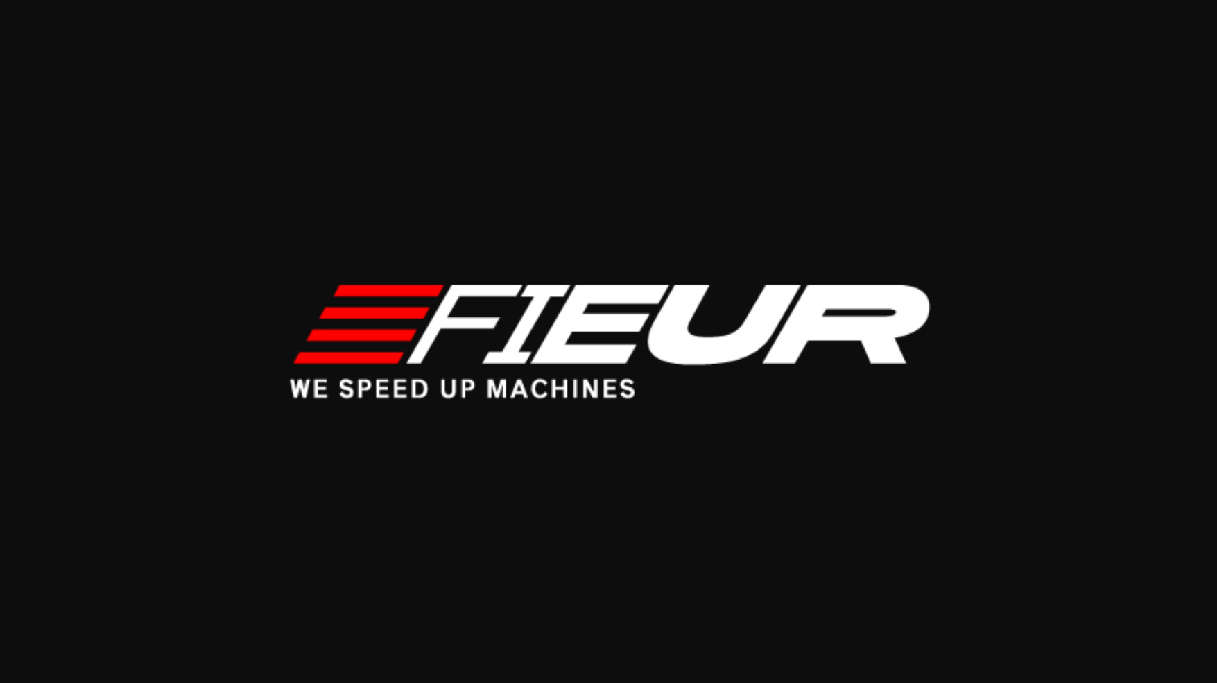
document in your favourite vector design software. Choose the font you just created and type the letters F-I-E-U-R. Then, make some design adjustments. In this example, we added some bars to the F in order to stick with the image of speed that a company like FIEUR would like to show.
The interesting part in designing a logo with Prototypo lies in the fact that in addition to your logo you get directly the font that comes with it. You are even free to create as many variants of the font as you want. That’s the perfect way to create a whole brand image, from the logo to all your communication supports.
[clickToTweet tweet=”Good Read | How To Create A Logo Using Web Application Prototypo” quote=”Good Read | How To Create A Logo Using Web Application Prototypo”]
In this example, we simply chose to go with the default Grotesk font from Prototypo for the motto of the logo, ‘We speed up machines’. That’s it. You just designed the first sketch of a logo in a few minutes.
This was just glimpse of what you can achieve with Prototypo, now it’s up to you to explore it, and create a font fitting your or your client needs.
Watch this tutorial in video: http://bit.ly/2hrwCEK
